The term ‘monochromatic’ is often used in interior design and decorating, but what does it really mean? More importantly, how can you use monochromatic scheme interior design to create a revitalising living environment, an inspiring workspace, or a fun entertainment area?
In this post, we’re focusing on all things monochromatic – what it means within the world of interior design and how to use the concept to make the most of any space.
What is Monochromatic Interior Design?
The word ‘monochromatic’ literally means ‘one colour’, but this doesn’t necessarily mean using a single shade to decorate an entire room! Instead, monochromatic interior design typically refers to using different shades, tones, and tints to generate different hues, effectively broadening the impact of a single colour. If you want to use red to decorate a space, for example, you could use a range of shades from vibrant pinks, bold scarlet or dark maroon to add variation to the design.
Of course, using a single colour to decorate a room will inevitably mean that it overwhelms the space, but using variations of this colour can have the opposite effect. To find out more, take a look at these seven easy ways to apply monochromatic scheme interior design in your home or workspace:
1. Select Your Colour Palette
Once you know which colour you want to use as the basis of your monochromatic interior design, you can begin to experiment and select your colour palette. Here, you’ll have the opportunity to incorporate different shades, tones and tints into your interior design.
Whether you end up using two or 10 different shades to decorate a space, your colour palette will have a tremendous impact on the overall effect. Due to this, it’s well worth taking your time and trialling different hues before you make a final decision. After all, the natural light in the space, combined with the dimensions of the room and artificial lighting, can affect how a colour looks.
By giving yourself a blank canvas and seeing how different shades look in various areas of the room, you can finalise your monochromatic colour palette.
2. Create Visual Interest with Prints and Patterns
When you’re using a monochromatic interior design scheme, don’t limit yourself to using only blocks of colour. While a burst of block colour can be impactful when used sparingly, filling the room with large swathes of block colour will soon become dull. Instead, add visual interest by using prints and patterns in the tones, tints and shades of your colour pattern.
3. Add Depth with Different Textures
As well as using prints and patterns to create visual interest, you can add depth to a room simply by incorporating different textures into your interior design. Even a combination of sleek, glossy paint and a matt finish can be enough to increase the depth of a particular area and create a more polished finish. However, it doesn’t stop there.
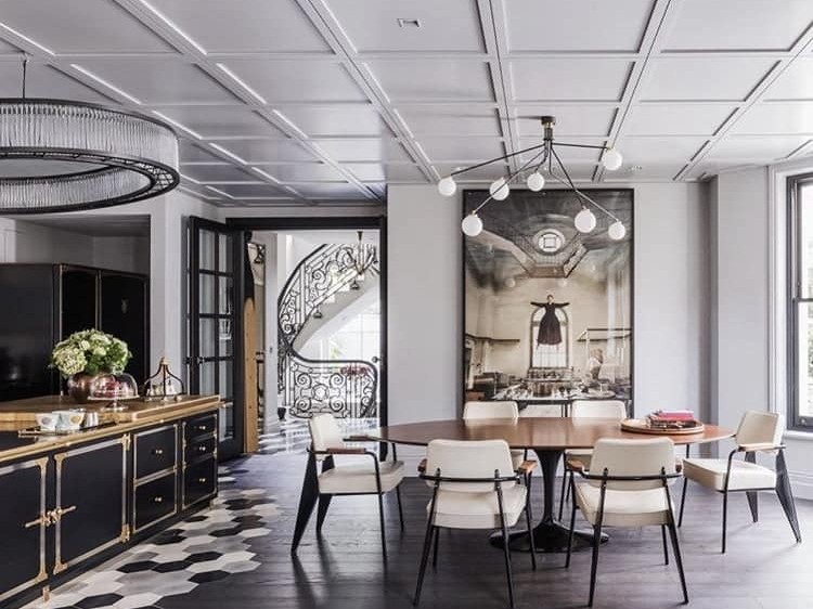
When you’re selecting furniture, artwork, and decorative accessories for the space, be sure to incorporate different textures here too. By using varying textures, as well as choosing pieces that match your style, you can increase the depth of your design and create a space that’s visually exciting and appealing.
4. Don’t Get Hung Up on Black and White
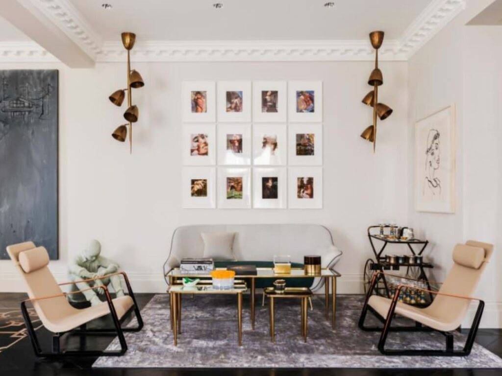
Many people assume that ‘monochromatic’ means a black and white colour scheme, but this isn’t the case at all. While true black, carbon black, black red, graphite, deep grey, charcoal, and black olive could certainly make up a fabulous monochromatic interior design scheme, you needn’t feel restricted when it comes to which colour to use as the basis for your design. Instead, begin by choosing a colour you love in a particular space and use a colour chart to identify the varying shades, tones and tints that will work well within the design.
5. Use at Least Three Shades
When you’re using monochromatic scheme interior design, it can be tricky to decide just how many shades or hues to incorporate into one space. Ideally, you should aim for at least three shades to create a varied yet cohesive look. Selecting a dark, middle, and light shade gives you the opportunity to experiment with varying tones and tints while adding light and depth to the space.
Of course, you don’t have to limit yourself to just three shades either. If you want to add more hues to your colour palette, simply look for shades that share the same base colour and feature different tones.
6. Let Contrasting Shades Draw the Eye
Contrast is an important principle of visual communication. It can turn a simple accessory into a statement feature and will draw the eye to wherever you use it. Even when you’re using monochromatic scheme interior design, you can use contrast to differentiate between features in a room.
If you’re using blue as a base colour, you might have a deep blue sofa topped with cornflower cushions, for example. Alternatively, using a lime green with a forest green will contrast in the same way and allow you to use your monochromatic colour scheme to highlight features in any room.
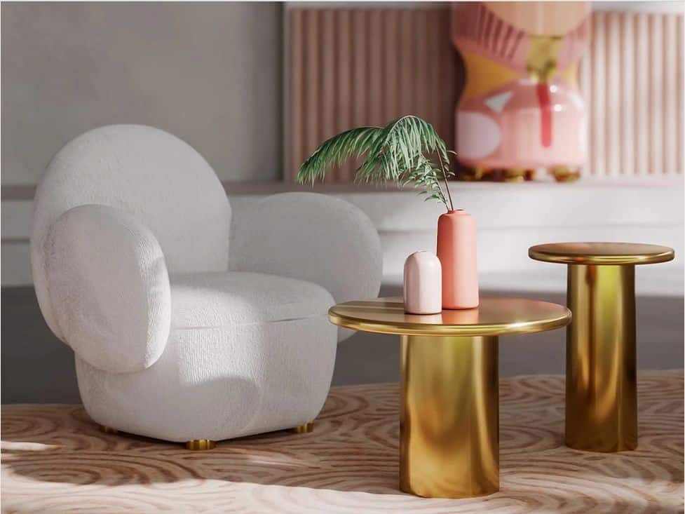
7. Incorporate a Neutral Colour
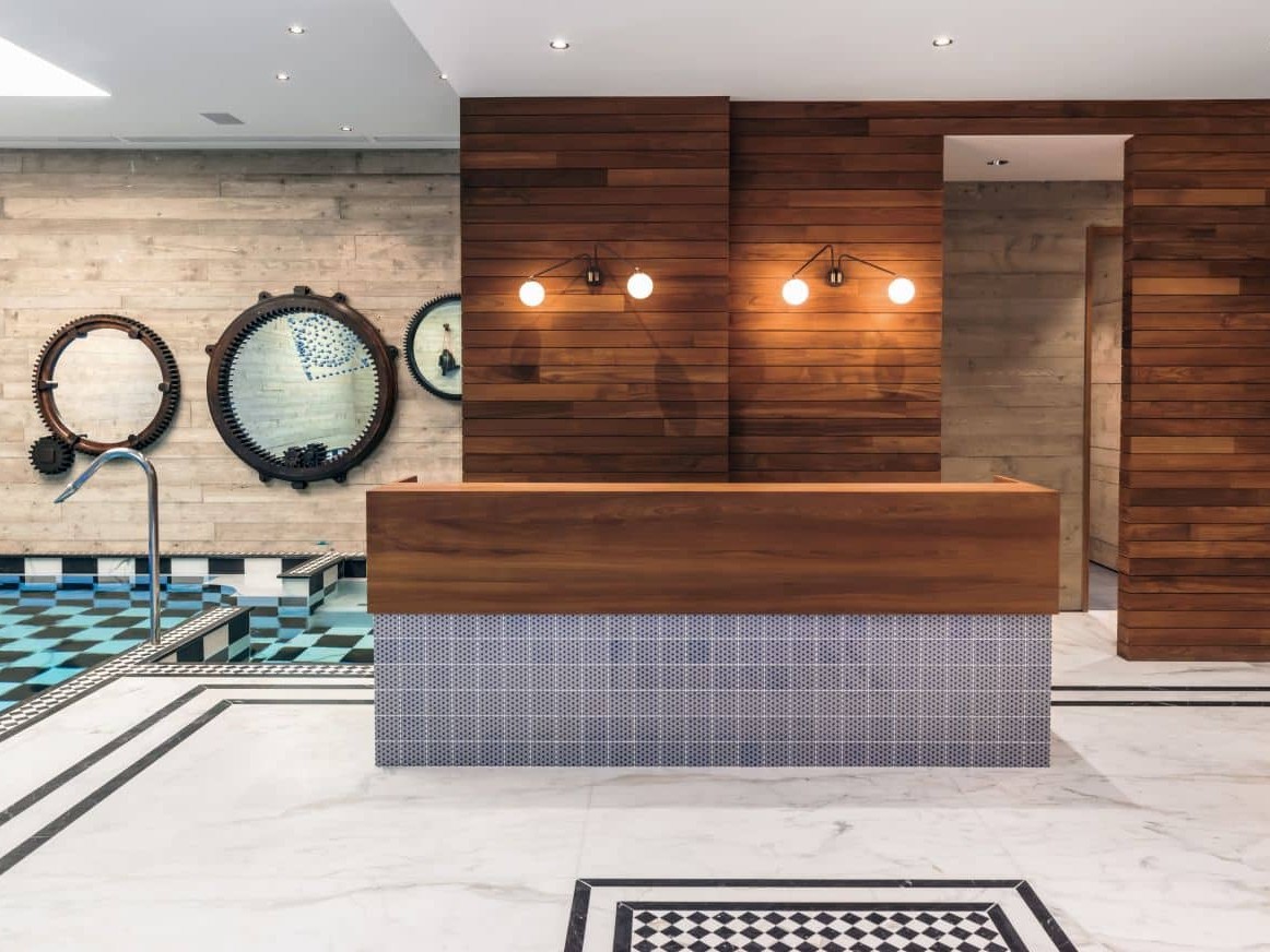
A true monochromatic interior features just one colour in varying shades and tones but this can often be overwhelming. To add balance, incorporate a neutral shade to ‘break up’ the monochromatic colour. A white kitchen island can look fabulous amidst a monochromatic colour scheme, for example, while a dove grey armchair can be a great neutral option in a monochromatic room.
Using Monochromatic Interior Design At Home or Work
From soothing tones for relaxing spaces to vibrant hues for motivating environments, you can use colour theory to help you create the look and feel you’re after and, with these top tips, you’ve got everything you need to begin planning your very own monochromatic interior!
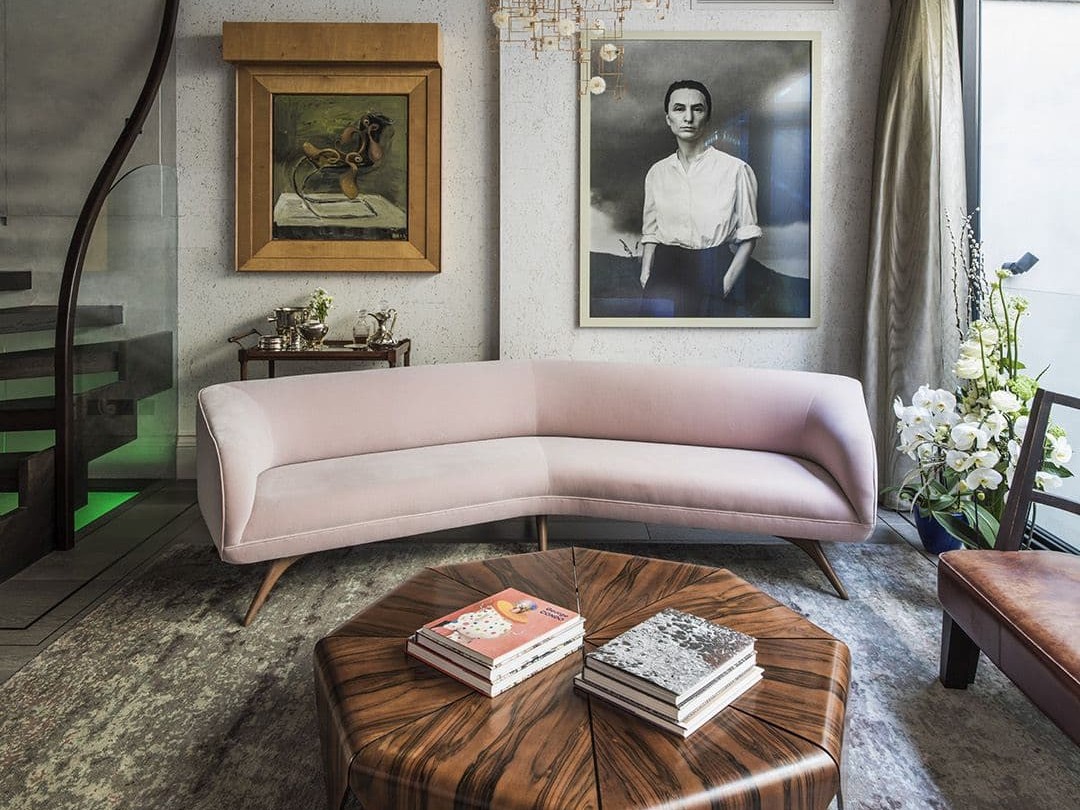
Interior Design Trends For Spring 2023
Expect plush velvets, dusty pastels and a focus on minimalism in our roundup.
The Art of Curating A Personal Collection At Home
Five ways your art can transform your home with soul, ambience and character.

Creating the Perfect Home Gym: 7 Design Tips for a Personal Fitness Haven
We reveal seven design tips for the ultimate, motivating workout space.
Open Concept Kitchen: Creating a Seamless Flow between Cooking and Living Spaces
Maximising your social and cooking space in an open-concept kitchen